

A New Logo for Laura Todd
on 10/04/20WHY DID WE CHANGE OUR LOGO?
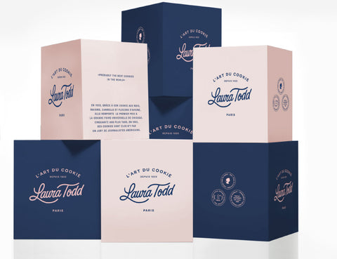
Originally from the United States, the brand arrived in France in 1985, bringing the first cookie to the French. Today, in 2020, the brand maintains its artisanal expertise in product preparation but aims for a more modern image! The blue and pink colors are retained but have been modified: a more vibrant blue, symbolizing serenity, and a lighter pink, symbolizing softness and femininity. The logo is therefore more dynamic, with a touch of femininity to evoke the brand's creator, Laura Todd, but with more blue in the visual identity, a cleaner, less busy, and easily recognizable logo.
The objective of this logo change was therefore to rejuvenate the brand image, to create a more elegant and modern logo while keeping the brand's historical colours since 1933: blue and pink.
The signature logo features only the Laura Todd lettering, available in blue or pink. The full logo also includes the elements "The Art of the Cookie" and "Since 1933." Indeed, we wanted to emphasize the company's founding date: 1933 in the United States. A Franco-American identity to bring indulgence, flavor, and quality to all our products.
THE EVOLUTION OF THE LAURA TODD LOGO:
A COOKIE ART MADE FOR YOU!
At Laura Todd, the Art of the Cookie is a very important phrase; it truly represents our artisanal expertise since the brand's inception. Our cookies are made with high-quality ingredients sourced from carefully selected local producers. They are handcrafted daily in our workshop in the heart of Paris and then baked on-site in each boutique to guarantee fresh and delicious treats. You can also find other products like brownies and mini-cookies in our various boutiques in Paris or on our online shop !


